In June 2021, Mentor rolled out a fresh new visual identity and new program names. As the pandemic threw the world head-first into an online existence, Mentor took the opportunity, and spent a good portion of 2020, working to strengthen its brand credibility, awareness and visibility to suit its growing and expanding audience and online environment.
The goal was to make Mentor more appealing and relevant for its key stakeholders. By finding a more youth-filled perspective that can easily be applied to everything from communications material to ambassador engagement, Mentor was able to embrace the coming generations of young people in the most authentic way.
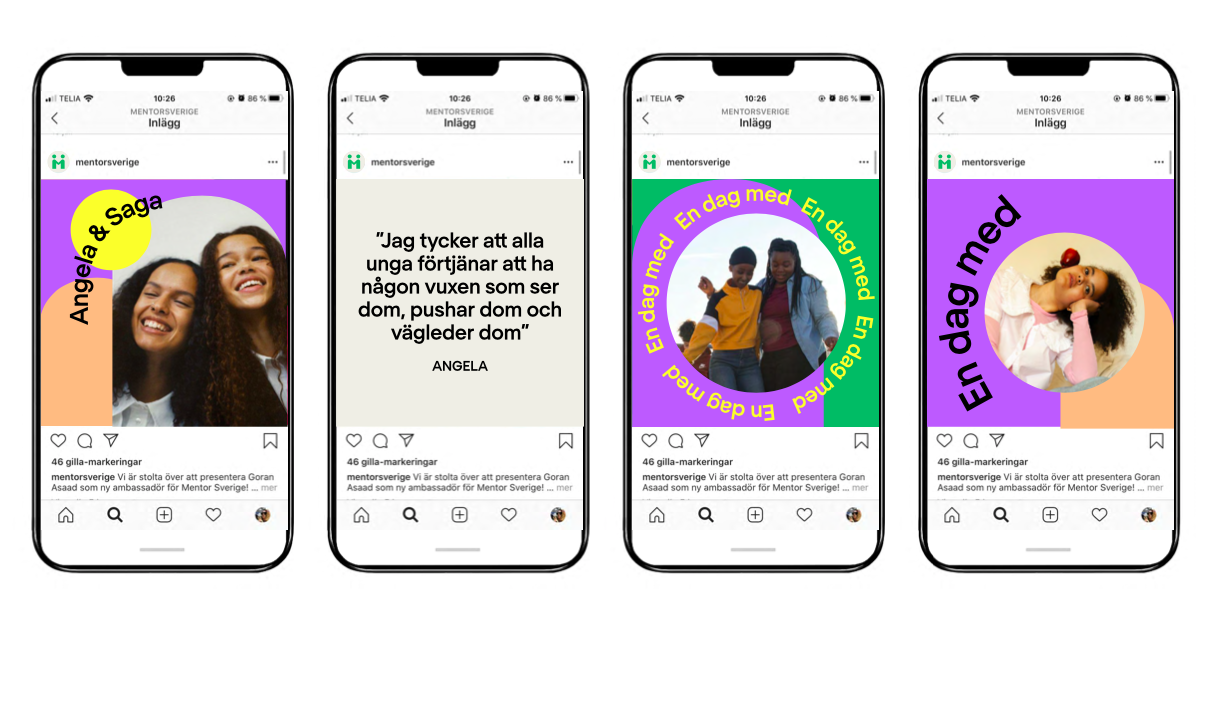
Together with creative partner NORD DDB, Mentor updated both its core program names and its visual identity. The program names changed from a professional, adult volunteer focus (career and parenting), to a more contemporary, youthful focus (infusing words such as inspo, boost and talks). The outward appearance and visual assets of Mentor were transformed into a muted color palette, a slightly lighter green logo and a new, more geometric typeface.
Mentor explored how the vernacular and visual world has developed in order to improve brand engagement for its digital implementations, which, in turn, will increase youth and partner engagement.
If this rebranding exercise has one key message to offer stakeholders, it is that Mentor is committed to continually improving and evolving in order to reach and support them – this means young people and society writ large – in the most effective way possible.
As Mentor has a single identity, this rebranding will be rolled out in all Mentor member country organizations over the coming months.